
Otherworld's hook horror, the latest addition to the FF project, is complete. The mini served as a testbed for some experiments with the color purple and its opposite, the notoriously tricky beast known as yellow.
A couple factors influenced the color scheme seen here. Laszlo Jakusovszky's Hot Lead: Painting Difficult Colors, where the use of purple to shade yellow is aptly demonstrated, was an eye opener. I needed to try it out.
Secondly, James Wappel's excellent purplish-grey gnolls caught my eye.
Also, I have had good results adding green to red and vice-verse (opposite colors again) and wanted to see if purple and yellow behaved similarly.


The skin was basecoated with Reaper's Rainy Grey (which has a decidedly purplish cast) and the carapace with Reaper's Olive Skin Shadow. The photos above show the other colors used to shade and highlight each area.

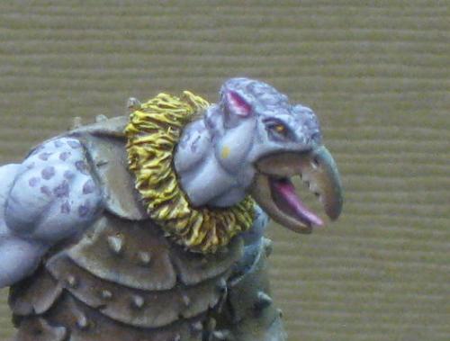
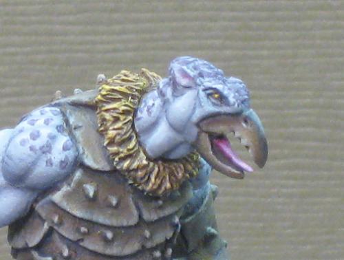
The feathers (or is that fur?) around the neck an wrists were basecoated with a mix of purple and yellow (specifically the two colors pictured at the top of the post), given a diluted wash of Secret Weapon's Sewer Water, and highlighted with more purple/yellow (less purple this time) (first photo). The highlights were dialed up with P3 Heartfire, Sulfuric Yellow, and Sulfuric Yellow mixed with Reaper's Linen White. This was washed with GW Casadora Yellow Shade (second photo). The result was good but a bit intense for my tastes. In the end I applied a dilute wash of the purple/yellow mix to calm things down (third photo).
The spots on the head and shoulders were first applied using purple mixed with a little yellow. Some of the original skin color (rainy grey) was then added to the mix and this was used to highlight the spots.


That is a superb looking mini. The blending done on the skin and armor is top notch, and now I'm jealous. I also love the colors used for the skin.
ReplyDelete-Nils
Thank you. Glad you like him.
DeleteExceptional work Finch, I love the subtlety of your colour choices.
ReplyDeleteThanks Rich and welcome aboard.
DeleteWonderful!
ReplyDeleteGreat work, I like it when you experiment with colours. Never really liked this mini, as I always thought the armour looks far too man made and uniformed. But you have done a wonderful job and have completely changed my mind about that mini. Well done Finch.
ReplyDeleteThanks ATOM.
DeleteThe experiment carried over from the shadow demon. I played around with some colors to represent the metal fittings on the treasure chest, was pleased with the results, and used essentially the same combo here on the carapace.
The armor was something of a concern for me too. Had bigger issues with those eponymous hooks though. Seemed to me that they should point down rather than up and be more hook-like (as opposed to blade-like). In the end I told myself to stop being such a nit-picker and just press forward. Glad I did. Came to love the sculpt in the course of painting it.